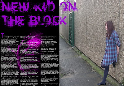
My first idea I didn't do anything I was just deciding the page break as I didn't want to get anything cut off in my page break also i was also get my title positioned right at the top of the page. But also to get the blank page half of my double page spread and also get my photograph half correct. The next idea of mine I got ideas from other magazines with the idea of text on a reactangle just below the title I thought it would be a good idea it is but I think its just too much for my double page spread which I don't want but the double page spread is linked together at the page break by the title but I don't think i will be going with this idea for my double spread. My next double page spread i used a grunge/ indie effect behind my text to link my double page spread to the music genre but I don't think it goes well with my music magazine its also i lighter pink which isn't part of my colour scheme but i think the double page spread looks boring and something missing from the design. The next idea is similar to my first where i was just planning the basics and i also added an effect of another photograph as i have seen it in other designs and i really like this photograph snap shoot effect as you get to see another side to artist a posed but a happy side to the artist so it makes it more approachable for the audience to see a happy side to her. The next idea i really like as it links together the front cover and contents with my double page spread but also the paint splatter makes the double page standout as it standouts from the black background but also the white text stands outs from the black background but also from the purple paint splatter, also i put some paint splatter on the photograph to keep the pages linked together and the photo snap shot also keep the double page linked together as some of it on the photograph to keep them linked together so they don't look out of place. My final idea I had seems very dark concept as it seems very dark which I don't think links well with the indie genre as its light and lively as well not just all dark, the moon effect would look better on a rocker magazine i just wanted to see how it looked and if i can still see the effect over the text. Out of my idea for the double page spread i am going to go with with paint splatter effect for my double page spread as it links well the contents and front cover but also link very well with indie genre and my magazine is all about the music.
Monday, 14 December 2009
Double page spread
These are a few mocks up with my photographs I took for my music magazine. I deiceded to go with this photograph as it links with my front cover as she is a very thoughful postion and again it makes the audience want to know her thoughts and ideas just like my front cover photogragh but also creates a moody atmosphere which again connects with music genre aswell as the rest of my pages.
Subscribe to:
Post Comments (Atom)


No comments:
Post a Comment