Saturday 28 November 2009

Front cover ideas


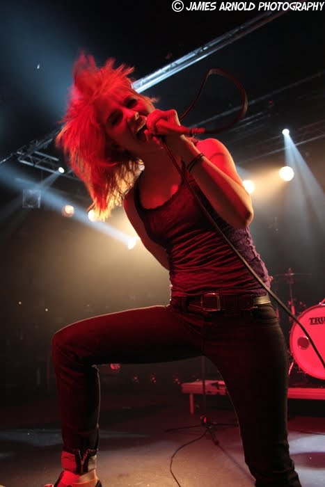
These are some ideas for my front cover I have tried many different effects on my front cover but also added some sub title headlines on the front to see where they would best fit on the page, but also to try it make it look realistic one you would actually buy in a retail shop or news agents. My first one, i decided to make the little things like the price and bar code standout
i added some pictures behinds them to make them stand out but also gives something else to the magazine it makes it look very creative and artistic plus its in the colour scheme as well and makes to magazine fit in well with genre of music its trying to promote. The next idea is very similar to the first one but i have added some text and used another butterfly splatter under the price one i did this to see what it would look like and i think it looks very good but could use something else to as it seems to be very spacious. This idea i used a paint splatter brush and made it a transparent so you could still see what the text is underneath it and i though this looked very effective as the splatter covers some of the picture but also some of the black space on the page and i really like it purple instead of it being white all the time and the splatter effects really makes the front cover standout and made it seem very unique. My last idea of my front cover i decided to get rid of the paint splatter in the corner and used a small spray paint brush on the front cover in a few black spaces and it looks really good like the last idea and the brushe effects fit in well with the colour scheme, layout but most importantly the genre of music but all the effects used make the front cover stand out and if the front cover stands out the audience is more likley to buy it but also what is inside the magazine also counts because that is what really attracts the music fans but how the front cover looks can depend on them buying the magazine and if looks great and of a high qualty they will buy it.


Sunday 22 November 2009

Double page spreads- ideas and planning


These are some of my ideas for my music magazine double page spread, I used an unusual image and again a black background to show my colour scheme and again to link all the pages together but i used this image as I liked it but i also thought it was a really good image to best represent my genre of music in my music magazine. My first idea was more of the layout and where I would put my image. My next idea was really decide where to put my title of the article but also to show that i am going to have my starting letter of the article a different colour to again show something different and creative just like the genre, the 'text' is to show that I am having my text in columns this idea is just to show a basic layout. My next double page spread is just showing what colour i am having my chosen font and how it would look I also have made it a conscience effort to have some of the title over on to the picture to keep the two pages linked together over the page break. Then I decided on my next one i would have the text all in columns but add some effects along with it i have chosen the a paint splatter effect behind the text to add something different to the double page to make it eye catching and more creative. The next thoughts i had was the have the paint splatter in the corner of the black background and the photograph to keep the pages linked together and also make it artistic and different as it represents the genre very well. My last idea was the have a rectangle over the middle of the page with a quote from the band and text all around it which makes it different and eye catching then i also added a box on the photograph as a little fact file about the band to give background information and with the paint splatter effect around it. Its distinctive and standouts welll from both photo and background and its nice as it gives a little bit more detail about the band.


Photogragh ideas for double page spread!!!


The original photo is on the left which i thought was really good as its different which i think attracted me to it as the band paramore lying on the road in the middles of no where and its really effective as the girl is in white is the lead singer and she standouts from the roads but also the band as they are all wearing a reds or dark browns. The photograph on the left i have edited by turning it around so now it looks even more effective as it looks like they are lying on a wall instead of the road and it shows the genre of music that is going to be in my music magazine and it also a photograph which i am considering for my mock up on my double page spread as it fits in very well with my genre of music but also as you can see i have used paramore all throughout my planning and my mocks up so it shows that they are the main article in my magazine for my mock ups so far. Plus this is a very unusual photograph which would grab the audiences attention.But also a title can easily fit across the image without chopping any heads of or anything important of in this photograpgh.

But I could also consider this style of photogragh which is unposed its an action of the lead singer, which would show the band actually performing live which shows the natural side to the band also but its showing what they do best but i also like this photograph because is natural and a action of the lead singer but i like that its in black and white its more effective that way as it standouts with the stage lights make it standout but also she is where a white shirt with black stripes which makes her standout and its also livley even though its in black and white image and busy with people in the background too which shows the energy the band as. I could also use this image for my double page spread as its showing an action which is very lively and would attract music fans but also its different but i would like it to be in colour instead as it maybe even more wild in colour. It would also fit in well with my colour scheme as the purple will really make this photograph standout more.


This is another action thats very lively and busy with colour which would make a really good image for the double page spread as again as it shows the singer performing and its natural also her hair is wild showing the idea of the performance and shows she is the one who makes the perfomance livley and sprited in the way she dances around and how she standing but also shows she loves what she is doing through her images and singing which would look good in my music magazine shwoing tha band loves music and it promotes a good ima
ge.

Thursday 19 November 2009

Contents plans and ideas


These are a development of my contents page but still planning processes as I started to put on images on for the layout and effects and where I would position my photographs and if I would tilt them or not and which images would best suit the magazine. The first one of my developments was just a normal idea to place pictures on it and tilt them images as it shows the originality of the genre with two images of a male and female picture to show that the magazine is aimed at both sexes. The next one is very similar to the first one put i moved the male image further in view and again both tilted but i feel that isn't very good as the pictures are to square and boring and very bland compared other contents pages which i have researched as they seem to be more lively and busy but still able to read clearly the pages. The next idea i decided to get rid of the male photograph as it didn't fit in well with my magazine but i kept the female image as it stood out from the dark background and the colours made it look very attractive for the target market to like it, also i started use some article ideas and my other font i would use for the articles on my double page spread and i started to find some 'gunge' or paint splatter images to add something unique and different. My next development, i deiced to use this image of a band which is quiet dark but i used the white effect behind it so they would really standout from the background and makes the picture standout as well to make it look distinctive as well, also the has males so i am still able to aim it my target market for both sexes and the contents page looks and links very well to the genre of music i am doing in my magazine. My final idea i used the pictures from the idea from before with the same effects which are white which i thought would be good as its part of my colour scheme and links the contents page withe genre of music but i also put page numbers by the image to give the audience an impression of what is going to be on that page number and the numbers really fit in well together with my music magazine contents page and it looks very effect and its doesn't look as boring as my very first idea as its more lively and artistic and it also links with my front cover as well due to the colour scheme and its easily to tell they are toegether and flow very well with each other.


Thursday 12 November 2009

Planning Contents Page


These are 6 ideas I have designed and thought about for the contents page of my music magazine I thought about the shapes and the colours I would use from my colour scheme and I came up with the idea of the white and purple shapes and the shape I thought of would be a rectangle but on other ideas the shape becomes distorted in the different plans I have created. I also thought about the the shape and colours reoccurring pattern with the shapes and alternating between the colours and repeating them. My first idea was the rectangle shape and repeating it a few times and alternating between the colours so it looks almost pattern like which i thought was creative just like the music genre the magazine is about. Then I changed the shape in my next idea as i kept the same layout but just distorted the shape which makes the contents page look orinigal and very imaginative which again links to the music genre. My next idea i kept the smae shape but changed the layout of the shapes as I have placed them all on one side instead to see what it would look like and it looks well as it standout from the background but i think it doesnt fill the page as much as the others did and the others did this and still made it standout. The for my next idea i decided to get rid if all the little rectangles i decided to go with one shape and one colour and deicded to distorted it even more and made the shape thick to fill the page put also long so text will be able to placed in the shape it looks creative and unusual so it again links the type of music to the contents page which is what I am aiming for. Then I deiced to spilt the shape in half and put one half on one side with the half on the other side to again make it different and standout from the page, for my last idea i just changed the colour of one of the shapes to make it standout from the page and see what it would actaully look like. The idea i am going to go with is my 2nd idea as i think it best repersents the music best but also thikn it standout from the page more and still keeps my magazine looking very creative.


Price research

For the price of my music magazine have seen examples of prices for other music magazines and the prices vary from £5.00 to about £2.50 and the price depends on what actually comes with the magazine like a free gift which makes the price higher but also that people want to make money from the magazine a profit, and shows that maybe its not all about the music it about the profit at the end of it which I don't want my magazine to be about I want it all to be about the music and giving the fans what they want and its them that actually makes the bands big. But there are actually magazines out there that aren't that expensive which give the fans what they want and at a reasonable price as well which show that the magazine company care more about what the fans want and the music in the magazine rather than the profit. So for my magazine I will instead to put the price around £2.00 so its affordable for the music fans and still making a bit of money but shows that my magazine is more about the music and what the fans want to read about instead of making it extermely expensive so they cant afford it, so this i think is the great price for my magazine and what I am aiming for is to make the magazine afforable but still give the fans somthing great to read about.

Tuesday 10 November 2009

headline plans


These are some ideas Ihave come up with for my headline the main article in my magazine I was think king about what i should do to make it standout from the background plus to make it standout from the background image as well but also again to make it creative at the same time so I added a tilt to some of them but also a background as some music magazines had a rectangle background behind the headline to again strike the readers eye but I think that they are effective for the text but I think that it cuts a lot of the photograph off at the same time as well. So my first idea I decided to use a shape behind the headline which I went with the colour purple as the fill on the shape as its part of my colour scheme and I thought this looked very good as it makes the headline standout from the purple background as the text is in a white font and is bold so it standouts from the purple but also standouts from the background and it makes the cover look very effective and eye catching I have also used a tilt on the text to show the creative side of the music genre and I am trying to link everything back to the music genre in my magazine as the magazine is all about the music genre. My other idea was to get rid of the background completely and just have the white font still in its tilt and its standing out from the background black and the photograph which it does and it what I wanted it to do but I think I should use a different colour as i have already got white font the page and would look to similar to each other but its still very bright and bold. Then I deiced to go again with a distorted rectangle for my next idea yes its like my first idea but I decided to change the outline line effect to a paint splatter and chosen the purple fill again and it makes the design look unique and creative as the shape is tilted and not the text this time which makes this different like the genre of music. Again I got rid of the shape but this time changed the colour of the font to a purple which i think really standout from the photograph and the background but also is very visible and easy to read and its very eye catching also it doesn't look the same as the title which is good and what I was going for. My last idea was more of changing the tilt to a more standard straight across but with a small title to show its creative and to link with the genre of music again and i just wanted to do this design would look like and it looks very bright again and standouts. The one I am most likely to go for would be idea number 4 as its unique but also creative but also its not the same colour as the title and still very visible and clear to read and links back to the genre of music and also I like that its tilted to the oppisite of the title of the magazine


Thursday 5 November 2009

Masthead


These are different masthead I have thought of and designed and I used my chosen colour scheme and I made the dominate colour black the background and then I have used the colours on the title of my magazine and I have deiced to mix the colours up on the title and also add a separate block at one point to the title to see what it would look and what it would look like in the different colours. The first idea i had was to have a purple background and the titles main colour to be white to standout from the purple but then i added a black colour actually around the title to make it able to read and I think its quiet effective as it looks like it would actually fit in pretty well with the indie music genre and I have stuck to my chosen colour scheme but I can see that it looks strange as it looks pixelleted in some part which isn't what I want for the title of my magazine, but I also made the title tilted to fit in with the creative and unique side of the music genre and to make it different. The second idea was to change the colours of the title as the white background with the main colour being black like the background but standouts as the colour around the text is a purple and this title Ithink is better than my first one as its more brighter than the first one but also dark at the same time which links back to the genre of music again and to make it look very creative and inventive. The next idea I decided to see how it would look like without the background and I think it looks better as I changed the colour of the title again to a white with a purple outline and again i decided to put it on a title and i think this one is very effective as it links with darkness of the genre but also the bright and unusualness but it really standouts and very eye catching which is what I was aiming for. The last final idea was a standard one to see what it would look like with the white text tile and purple outline but not on tilt but I think it isn't not as effective and doest really show the sides of the music and just looks simple and not very artistic. So i am going to go with my 3rd idea as its the most effective and really stands out.


Wednesday 4 November 2009

Colour schemes


These are the colour schemes I have come up with, I think these colours should be dark but also at least one bright colour in the colour scheme to make it stand out. I think the best dominate colour would be black as it fits in very well with the type of music that's is going to be present in my music magazine and black would be the colour to be used as the background throughout my magazine, and it would keep all the pages linked together. I like the first colour scheme as the black and blue work very well with each other and the blue really standouts out from the black and with the white it will also make the blue stand out as well which is good for the magazine and the colours link really well with the music genre. I thought of the standard colours for the a indie music magazine and just came up with light tones of the main colour black and i thought grey would stand out from the black and then the one bright colour white would stand out from both of the colours to make it grab the target audiences attention but this colour scheme i think is boring and not really that colourful colour scheme so i don't think i would chose this one as i dint think it would appeal to both sexes and its more of a make colour scheme and i want to try and attract both sexes of teenagers. The next colour scheme is different from others as there is another dark colour brown as well with again a purple at first it looked alright but then its too much dark and i don't think its right colours for the music magazine and doesn't really fit in well with genre of music. The next one i like as its a mixed of bright but also dark colours and i think it would appeal to both sexes of the teenage market as the blue and the purple are liked by both sexes also they both link well with the music genre and stand out from the black background and also to grab the attentions of the reader but also to make it easy to read the articles inside. Now, the last colour scheme i think is my favourite as all the colours go well together they standout from each other and the audience will be able to read the articles with these colours but i may change this as it has four colour which maybe too much and may get rid of the grey as then its even easier to incorporate into the magazine, so it would be black, purple and white instead of black, grey, purple and white.